Back to Insights
12 Questions About Your Advocacy Program Most Platforms Can't Answer (And How AdvocacyAI Fixed Each One)
Tools & Technology
Ada's TL;DR digest
Most platforms can't reach the advocacy data that matters, so at AdvocacyAI we built the solution. Here are 12 questions about your advocacy program that most platforms can't answer.
Ask a board member how the advocacy program is going, and the honest answer is usually two numbers: how many emails went out, and how many people clicked. Everything the board actually wants to know sits one layer below that: who finished the action, whether a lawmaker's office opened the message, whether the people on your list are even registered to vote. Most platforms can't reach any of it. The data is usually sitting right there in the platform your team already uses; it was just never built to surface it, the way marketing platforms have surfaced source, conversion, and open data for fifteen years.
I've heard some version of all twelve of these from teams on calls with us. Below is what they can't measure, what each one costs, and what we built at AdvocacyAI to fix it.
I've heard some version of all twelve of these from teams on calls with us. Below is what they can't measure, what each one costs, and what we built at AdvocacyAI to fix it.
How do I find out which congressional district my supporters live in?
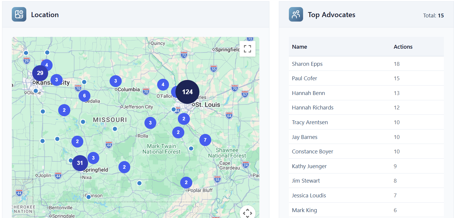
You upload a list of supporters and hit the same wall every time. You don't know who represents them, so you can't target by district, can't report coverage to a coalition partner, and can't tell a lawmaker's office how many of their own constituents back you. That answer determines everything that comes after it: who to email next, which office to call. We match a list to congressional and state legislative districts on upload, and across our customer base that match typically finishes within about ten minutes of opening an account.
From there you get a map of where supporters live, a coverage breakdown against every target district, and audiences you can pull in plain language, like advocates in a specific state senate district or in Ohio House District 13, without exporting anything. Coverage becomes a chart you can hand a coalition partner instead of a hunch you carry around.
From there you get a map of where supporters live, a coverage breakdown against every target district, and audiences you can pull in plain language, like advocates in a specific state senate district or in Ohio House District 13, without exporting anything. Coverage becomes a chart you can hand a coalition partner instead of a hunch you carry around.
How do I know if a lawmaker's office actually read our advocacy emails?
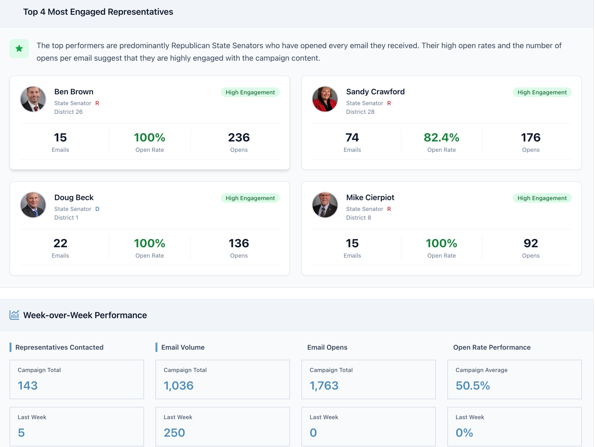
Most platforms report how many emails were sent, sometimes broken out by district and lawmaker, and that send count ends up as the only success signal anyone has. Nobody knows what happened after the email landed: whether a staffer opened it, skimmed it, or archived it with the day's other mail. We attach tracking to every message an advocate sends, so you can see when a legislative office opens it and what share of everything you've sent them has actually been opened. That rolls into a lawmaker report in plain language: who's reading you consistently, who's opening occasionally, who hasn't opened anything at all. Each office gets a grade, and you can build a follow-up campaign straight from the report with one click, aimed at the offices that have gone quiet.
Why do some advocacy campaigns perform better than others?
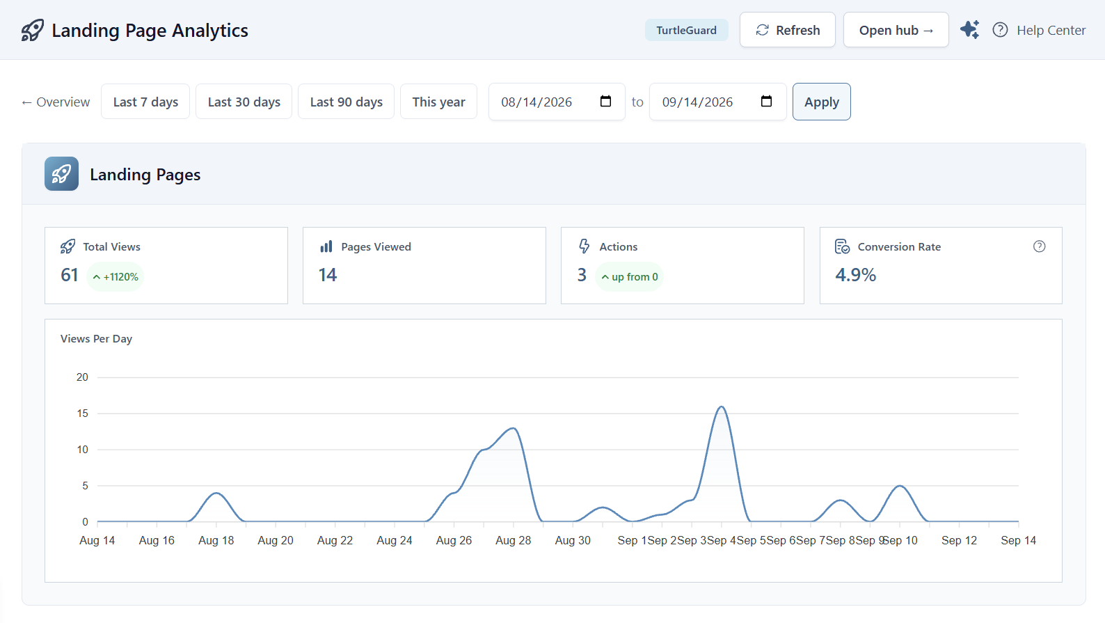
Answering this usually means exporting everything to a spreadsheet, lining campaigns up by hand, and guessing at why one did better than another. The guessing is the part worth naming. I've watched teams spend an afternoon on it and still end up with an opinion instead of anything they can point to. We put campaign-over-campaign performance and engagement over time in one view, so a full quarter of campaigns sits side by side instead of one at a time. Every landing page lives in the same place too, showing views and conversion rate, the share of visitors who finished the action instead of leaving the page open in a tab. Most advocacy tools show one page at a time and often skip conversion rate entirely. Seeing every campaign next to every other one is what turns a guess into an answer you can point to.
Where did our advocates actually come from?
You send an action out through email, Facebook, Instagram, LinkedIn, and a partner's link, and by the end of the push the list is just a list: one pile of names with no record of how anyone got there. For us this was common sense, because every marketing tool has tracked where a contact came from for years. We tag links with UTM codes (short tracking tags added to a link that record where a click came from) and report results broken out by source: email, Facebook, Instagram, LinkedIn, a specific partner. That tells you which source is actually producing advocates who stick around, so you know where to spend the next push's budget. A partner can be credited by name instead of folded into an "other" bucket.
How do I tell which of our advocates are also members, donors, or event attendees?
The answer usually lives in six different places: two email platforms, two CRMs, an events tool, and a form builder. Reconciling all of it turns a simple question into a multi-week project, and nobody wants to run that project every time the board asks a version of the same question. We build custom fields directly into the advocate record, so any data point living elsewhere attaches to the list that's usually the largest one an organization has. Membership status, event attendance, a donation, a survey response, a personal story — all of it stays on the same record, searchable, instead of being rebuilt from scratch each time someone asks. Pull up any advocate and you see the whole relationship in one place, not just the last action they took.
Who are our most engaged advocates, really?
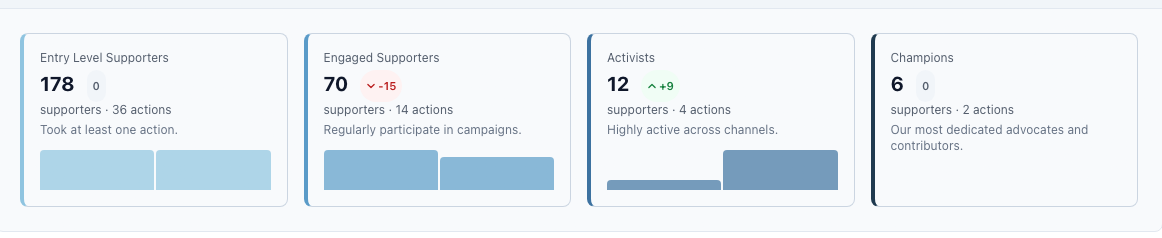
The usual answer is whoever completed the most actions, which mostly measures willingness to open an email and click a button. Willingness to click and willingness to show up are different things, and the standard ranking treats them as the same. We built a fully customizable engagement ladder that assigns points by action type, so the ranking reflects effort instead of frequency. A good ladder gives someone who isn't ready for the biggest ask another way in (a share, a signature, a story) and lets them move up from there. The payoff is operational: in any district, you can pull the people who will testify at a hearing, share their story publicly, pitch a reporter, or travel to the Capitol with your team.
How many people who clicked actually completed the action?
Email platforms give you click-through rate (the share of people who opened a message and clicked the link inside it), and that's where most reporting stops. Between the click and the finished action, a real share of people fall off, and click-through rate never tells you how many or why. We track action rate (the share of people who actually completed the action, not just clicked toward it) per individual email, so you see how a specific call to action performed and who followed all the way through. Across our customer base we see completion running anywhere from roughly 30 to 80 percent depending on the action, a wide enough range that click-through rate alone tells you almost nothing about whether a campaign worked. Once you can see who completed the action, you can build audiences from the people who reliably follow through.
Which of our advocates are major donor prospects?
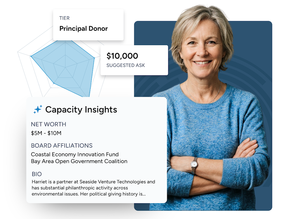
Where advocacy feeds fundraising, the handoff is usually just list access: the person becomes eligible for the same asks as everyone else, and almost nothing from their first action follows them into the donor file. Someone who might be a major donor gets the same small-dollar ask as a first-time giver, and nobody notices until much later, if ever. We surface donor data on high-value prospects at the moment they take an action, and flag them in your audiences automatically. A likely major donor isn't sitting in a low-dollar queue before anyone has thanked them for showing up, and your development team gets a flag instead of a surprise months into the relationship. The framing that matters here: identify people who care about the mission first, and their likely gift size second.
How many of our advocates wrote something personal?
Some platforms let you see which advocates edited the message they were handed, but a program-level rate (what share of everyone wrote something of their own) usually means exporting the whole campaign and counting by hand. I checked the published benchmark reports across the advocacy category, and none of them report a personalization or edit rate. This is genuinely unmeasured industry-wide. We do two things about it. Edited messages can be held for internal review before they send, so someone reads the advocate who described how an issue actually affected them. The personalization rate sits on the front of the dashboard instead of buried in an export. Story tools work the same way: written and video submissions attach to both the advocate's profile and the campaign, using the same message-personalization engine that matches a lawmaker's record and local data to what an advocate writes.
Who on our list actually knows a lawmaker?
The most valuable people on your list are often invisible on your list: someone who went to college with a state senator, or worked in a district office years ago, looks exactly like everyone else in the database. Advocates can log a relationship with a lawmaker directly, recorded on their profile, so you can see who has a family connection, who's campaigned for someone, who's a personal friend. Personas plus custom fields let people identify themselves (nurses, pharmacists, mechanics, business owners, executives) the moment they take an action, through a single question attached to that interaction. We cover what a persona is and how to set one up in what is an advocacy persona. Either path turns a name that used to sit flat in a spreadsheet into someone you can call on for a specific ask.
What does our advocate list look like — party, age, and turnout?
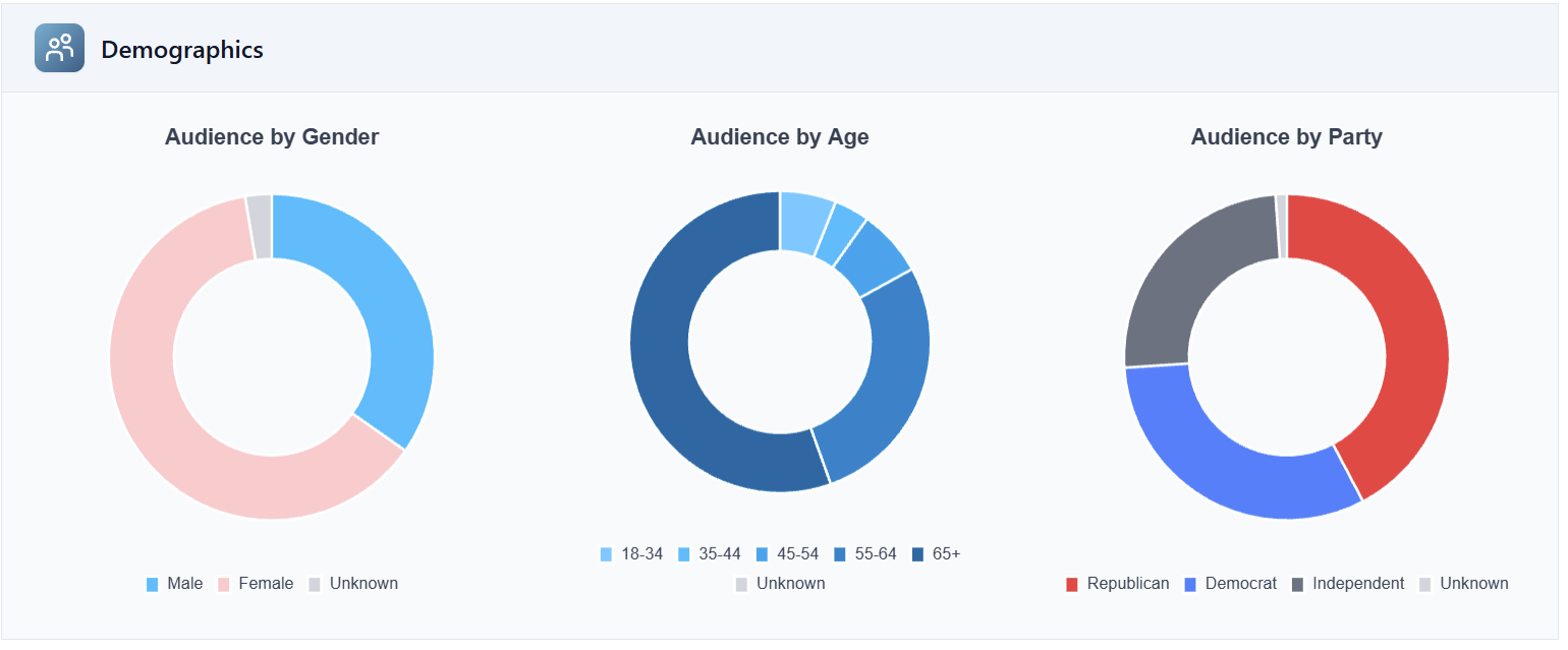
Teams assume answering this requires a five-figure data project and a vendor contract, so most never ask. That assumption used to be correct: enhanced voter files with modeled demographics run somewhere between five and fifteen cents a record depending on the modeling, which adds up fast across a list of any real size. We match against the voter file natively and provide the audience breakdown as standard, so it's already on the page when you log in instead of a line item you budget for separately. That's real budget an organization can put back into the program instead of a vendor invoice. Audiences pull instantly, the same way they do in NGP VAN or EveryAction, so the question turns from a project into something you can answer before your next call.
Are our advocates actually voters?
Advocacy works because constituents contact their own lawmakers, and the power in being a constituent is tied up in being someone who actually votes. Almost no organization can currently confirm that the people on its list do that. I think that's the biggest blind spot in advocacy reporting, and most programs have never had a reason to name it. We match against the voter file and show active voters directly on the dashboard, both as an internal signal for your team and as something you can say out loud in a legislative office. The signature on a petition tells you who raised their hand once; the voting history tells you who keeps showing up. Most organizations have never had a clean way to ask that second question.
What happens to your goals when you can't measure any of this?
When a team can't see the twelve things above, it's usually left chasing two goals: broader engagement across the email and text list, and list growth. Both are feel-good numbers. They tell a board that someone is doing the job, but neither one moves policy, which is the actual goal and usually gets left out of goal-setting because everyone assumes it's already covered.
I've watched this play out the same way in board meeting after board meeting. Once you can see distinct action types, repeat action-takers, donor conversion, event turnout, and voter status, goal-setting changes shape. Volume tells you what happened; influence metrics tell you whether it mattered. Goals can be built on the number of distinct action types taken per quarter, growth in repeat action-takers, money raised, event RSVPs, and voter-registration verification checks run during a GOTV push, exactly the kind of goal a dedicated GOTV program is built to run and measure.
Teams that can see all of this spend their time on the work that matters instead of chasing numbers that don't.
AdvocacyAI has been named Winner — Best Advocacy Technology Platform (2024 Reed Awards) and Winner — Best Innovation in Advocacy (2024 and 2025 Reed Awards). If one of the twelve items above is the one costing your team the most right now, book time with us and we'll show it to you on your own list.
If one of the twelve items above is the one costing your team the most right now, book time with us, and we'll show it to you on your own list.